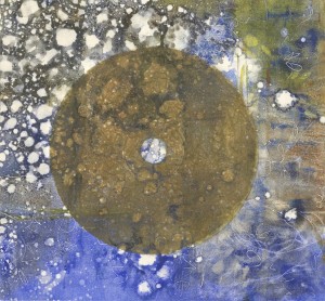
If anyone is going to be in Atlanta between August 5th and September 3rd you should visit the show at Whitespace. My friend Ann Stewart, who was a year ahead of me in the MFA program at Michigan has a show with the Atlanta artist Seana Reilly. Ann makes incredible works on paper using graphite and erasure. The depth and delicacy of the pieces means that they are best seen in person, but if you aren’t going to be in Atlanta during the show you can see her work on her website, www.annstewart.net.
Daqing Construction
The area where we were in Daqing was all completely new. Zheng Xuewu said that this winter when he looked out the canteen window it was all grassland. Now there is a new housing complex going up, universities, a new library etc…. I love the patterns of all the construction cloth and scaffolding and cranes so I took a lot of pictures. There was something too about the grasslands full of herons turning into green wrapped buildings and bird-like cranes… I admit I loved it less when the noise from the construction woke me up at 5 am, but as it was already a couple of hours after sunrise it was hard to complain.
From the studio: ink painting and drawing at the Dapu International Art Center
This is one of the images ZhenZhen took to put on the China Dapu International Art Center website. The studios are absolutely beautiful. We were housed on the 4th floor of the center and the sun would come in through the big windows all morning. Every studio in the center had wonderful light. We also had a bathroom with a shower, a bed, wardrobe, desk, office chair, stand up fan, easel, drawing board and best of all this huge rolling painting table. They even provided us with a clothes rack to dry our clothes on (right before this picture was taken I was frantically taking everything off the clothes rack and putting it in my closet so my underwear wouldn’t appear on the internet). My only problem was that the walls, like most Chinese studios, were made of concrete, which meant that it is almost impossible to attach anything to the walls without using very large nails. Since I was planning on doing large drawings during the residency, this was a bit of a problem. But since we were in a construction site I easily found a way to hang my work by using some tough plastic strapping which I nailed to the wall and clipped my drawings to. Once I had this set up I was ready to work.
In this picture I am working on the acrylic and ink wash painting behind me. I’ve also been experimenting with ink wash on various sorts of Chinese paper that Peter brought and practicing my calligraphy, which while not brilliant helps me increase my coordination and focus.
What is Contemporary Art in China?: Show and Discussion at the Contemporary Art Research Institution at the Art College of Daqing Normal University
During our first week at the Dapu International Art Center we were invited to show our work in the Art College of Daqing Normal University alongside Daqing artists and to participate in a discussion about the meaning of contemporary art in China as part of the opening of their Contemporary Art Research Institution.
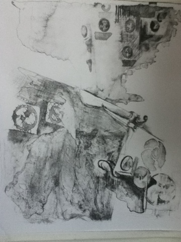
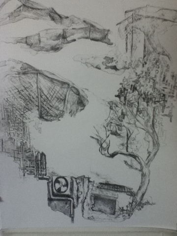
Daqing artists works were primarily oil paintings, though there were also a couple of ink paintings and sculptures. The work ranged widely in style and I would say in general experimented more with technique and medium than with concept. Denise submitted a series of photographs printed on silk of site-specific installations in Ireland. Peter submitted a series of small highly detailed etchings. Namo submitted one of his box installations, and I submitted three lithographs.The director of the residency program, Zheng Xuewu, submitted one of his installations that consisted of famous books whose pages have been turned into knots. During the opening the new research institution was inaugurated and certificates were given to all of the participating artists (both local and international).
Afterwards all of the artists gathered together around a table and discussed what was “contemporary art in China.” The international artists had not realized that we would be participating in a discussion and needed to prepare something to say, but we all managed to give a short talk in Chinese. This was probably the first time I had been asked to present my views about contemporary art in China in Chinese to a group of fellow artists, and I admit I was quite nervous. I talked about the varying approaches to art both in the US and China, emphasizing that art is constantly changing and is multifaceted rather than a united movement. Americans are no more certain of what contemporary art is than are Chinese, and we are often debating about its nature and reshaping both visual and critical discourse as we go. I said that we can know what modern art is, or the new wave movement in china or anything in the past, but contemporary art, by its definition is what we are inventing together at this very moment and is in the process of formation. I am not sure how articulate I was on the spot, or even how grammatically correct, but the other artists on the panel seemed to follow what I said and were very supportive of our efforts to speak Chinese, for which I am deeply grateful.
I was completely fascinated by what each artist said at the table and the variety of their points of view. However, I am afraid to quote them here since I am sure I missed a fair amount. I know several artists addressed issues of the market defining art and the need to have some other measure of what is contemporary besides what sells. Several artists raised the issue of Chinese art’s ambivalent relationship to western art, and the conflicting desire to bring in western art as a way of advancing or entering the global art market and the need for China to define for itself what contemporary art is. There was a suggestion that while western art makes progress through continually coming up with something new in opposition and reaction to what comes before, Chinese art draws together a whole world of styles and then sees what happens out of the mix. Another artist suggested that Chinese contemporary art might develop out of a model of struggle, bringing in foreign art and then struggling with or against it. The foreign artists complicated the dichotomy of east and west by our geographic locations (Australia, Korea, Slovakia and America), the diversity of our own education, and the sense that while all of us were foreign born we were to varying degrees deeply influenced by Chinese culture (Namo having lived in China for 20 years and Denise for six). I hardly do justice to the conversation, but took away from it a sense of the diversity and depth of the discussion and also the dedication of local artists to dealing not only with the general question of “what is contemporary art?” but the related question of cultural influence.
Arrival at Dapu International Art Center
So I am finally back to blogging again and have a lot to catch up on. I just came back from a wonderful trip out west to Dunhuang and Chengdu.
Now I am getting an opportunity to see a very different part of the country. I am at the Dapu International Art Center Residency Program in Daqing. Daqing is a large oil mining city in Heilongjiang province in far north-eastern China which I will write more about in my next post.
A group of international artists and the residency program director, Zheng Xuewu all drove up from Beijing. When we arrived in Daqing we were met at the bridge by a bicycle team and people from the art center.
Color Lithography
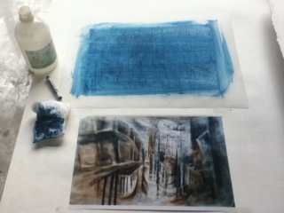
In the last month I have finally pulled a colored print ( just in time before the studio closed for the summer holidays.)
It turns out that the process of substituting colored ink for the black proofing ink is quite simple. Because the color ink is much looser and uses a hard rubber roller rather than a spongy rubber or leather roller (my studio uses rubber), rolling up the stone only takes one or two passes. Since I don’t have to go back and forth between the slab of ink and the stone for each print, it takes only half the time.
The color inks are also more transparent. The lighter an ink the less contrast there is in the image. When I printed this light blue background for instance I realized that I lost depth and detail because it is harder for the eye to detect variation when the ink is only slightly darker than the color of the page. Like in screen print, a color lithograph seems to need more layers to create a sense of depth, particularly if the colors are mostly light. I am considering adding a darker blue purple or deep maroon plate to this print to add depth and detail. I originally planned for the print to be black and sepia as in the original conte crayon drawing but I wanted to experiment more with what color could do.
lithography syllabus
I am looking for lithography syllabi.
I am currently comfortable with the printing and registration process and am trying to fill in the gaps in my knowledge while I wait for my teacher to teach me how to print in color. Having a list of skills I should accomplish within a semester would help me ensure that I am not missing any major topics since I do not a regular class but rather need to ask the professors to teach me certain skills.
Central Academy of Fine Art BFA Show, 中央美术学院毕业展览
Love and Hope Art Auction for Japan
Troubleshooting: Overexpossing the litho stone and fill in…aka the print graveyard
unfortunately this is the second time I have ruined a stone in the acid process. This time I am pretty sure I processed the stone correctly the first time, but there were two spots on it that were still too dark, so I spot etched them with acidic gum. I think I etched them too long and so they rejected the ink and wouldn’t roll up properly. In the process of trying to get the stone to take the ink I managed to destroy the balance between water and oil, perhaps by letting the stone get to dry or adding to much ink, so it began to fill in. I washed the whole thing out, re-inked the stone and re-gummed it to see if I could re-enforce the areas of too much or too little ink. Sadly it looks like I now have a gray splotchy print with areas that were supposed to be dark now completely black, except for the two over-etched spots. Time to start over. I suppose litho is a good lesson in detachment and letting go…
These are the before and after images-anyone out there know what happened? It looked fine after the first etch, and completely strange after the second etch.
Combining Subtractive Techniques, Litho Crayon and Tusche Wash
These images use a combination of tusche wash and litho crayon which is then altered by scraping out lighter areas with a razor blade.
In the image below crayon lines were drawn onto the stone and then layers of tusche were applied on top. The crayon slightly resists the tusche wash which helped keep the tusche wash within the lines in areas with a lot of detail. Some of the areas with reflections have also been scraped with a razor to add in the white highlights.
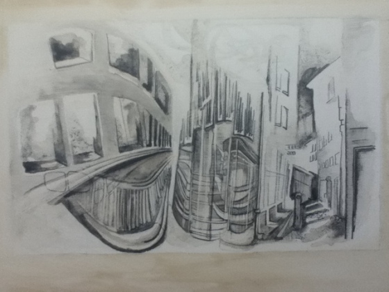
Another subtractive method I like to use is laying down a dark tusche wash and waiting untill it has almost dried. I then go back into the tusche wash with either a clean brush dipped in a little water or a stylus and draw through the dark areas, “erasing” them. Reworking tusche creates unpredictable results, but this is part of what I like about the technique.
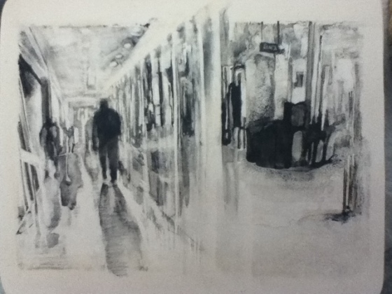
In the image below I primarily used very loose layers of tusche wash. Most of the sharp edges are created by scraping out areas of the tusche wash with a razor blade.
Transfering an Image to a Litho Stone, Making your own carbon paper, registration
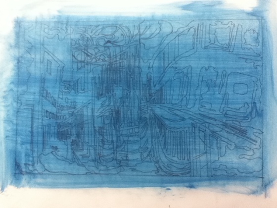
An image of the transfer paper.
Steps to make transfer paper and copy an image to a stone:
1. print out the image you want to use, make sure the image is at least a couple of inches smaller than the stone so there is a 1 inch margin all around. If you want to register the image on the stone (for example, to print two colors or more on top of one another) the paper must also be slightly smaller than the stone, so the margin between the image and the edge of the stone is the maximum amount of white space around the final print.
2. cut a piece of stiff translucent paper (frosted mylar, vellum) so that it is larger than the image
3. tape the image down so it wont move while you are tracing it and tape the translucent paper on top.
4. With a thin felt tipped permanent marker trace the image. Even if you are planning to later separate the image onto different stones (in order to print separate colors) do not separate them yet- trace all the colors together. If you want, it may make it easier to trace the different colors with different sharpies. (This is the way my teacher taught me, for more complicated color separation it may work to initially separate the colors???)
5. Turn the translucent paper over. On the back (the part not drawn on) take a soft chalk pastel in a dark color and completely cover the back.
6.Put rubbing alcohol on a piece of cotton and rub it over the pastel creating a smooth thin layer of chalk across the entire back.
7. Let dry.
8. You can now transfer your image to the stone.
Steps to transferring the image onto the stone:
1. Once the transfer paper is dry tape the paper tightly onto a prepared stone, making sure that the image is centered on the stone.The chalky side of the paper should be face down on the stone.
2. Trace over the lines of the image with a ballpoint pen. If your image has more than one color, only trace over the lines that represent one color. For example, in the image above I have two colors, brown and black. My first stone is only the brown lines and tones, my second stone will be only the black ones.
 3. Once the image has been completely transferred you may want to protect the margins of the stone around the image by painting on a thin coat of gum arabic. Wherever the gum is painted on it will protect the surface of the stone from oil (see picture to the left)
4.The image will be transferred as a series of thin outlines onto the stone. Since the lines are in chalk and not oil based, they will wash of the stone. You can now begin to draw on the stone, filling in the outlines while referring to the original image as in the picture below (here I am using a combination of tusche wash and litho crayon).
Contemporary Chinese Lithography 中国当代石板画
I am often asked why lithography, both by friends who see it as too slow and painstaking a medium to be “contemporary” and by those who believe that foreigners should only study “truly Chinese” media while in China. While I will talk more about my own purposes of the project in other sections of the blog I want here to explore what Chinese artists are working in lithography (it is indeed a fairly small number) and how they may construct or complicate narratives of modernity and nationality– and perhaps of gender and cannon formation.
Below are images of work by Chinese artists who are either lithographers or have worked in collaboration with lithographers at some point in their career.
I am entering the information about artists as I find it and gradually weaving it into a narrative along with links to relevant websites and articles. Please bare with me as I construct this post.
* by artist’s names indicate that these are the lithographers my professor suggested I look at. There is not yet any logic to the order of the entries. Since I am trying to get a sense of the breadth of contemporary lithography in China I am trying to include not only my favorite artists but those that may be obscure, some work I may like much better than others.
Lin Tianmiao
Much of Lin Tianmiao’s work is in sculpture and installation, often using thread and techniques of embroidering and embossing. These lithographs on handmade paper were completed while she was at a residency at the Singapore Tyler Print Institute in 2006.
“Lin Tianmiao was born in Taiyuan Shanxi Province, China in 1961. She studied Fine Art at Capital Normal University in Beijing, and then at the Art Student’s League in New York. For nearly a decade she and her husband, artist Wang Gongxin, lived in New York City, where she designed textiles until the couple moved back to Beijing in 1994.”– Mary Ryan Gallery, New York
Perhaps one of the most challenging problems of lithography is that it is a chemical process involving the use of oil and water which means that everything, from how humid it is outside to how well you wring out a sponge can alter the final outcome. It is also highly labor intensive, requiring hours of grinding a stone with sand and a piece of glass.
In an interview with the art critic and historian PiLi, Lin Tianmiao describes the process she values in art. While much of her work is three-dimensional, her words speak eloquently to what I find so intriguing about the process of lithography.
“Handwork has a randomness while the mechanical work only has accuracy, without that unexpected randomness. The randomness of handwork can fall within the control of man and can be added, reduced, maneuvered and used at any time.” — Lin Tianmiao, www.lintianmiao.com
The lithograph series focus and Seeing shadows deeply influenced my MFA work. Below is an excerpt from my thesis:
My current method of drawing began when I walked into Long March Space and saw Lin Tianmiao’s two series of low contrast monochromatic prints that use a combination of lithography, screen print, embossing and sewing on handmade paper. The two bodies of work, entitled Focus and Seeing Shadows, both play with the relation between surface and depth in the prints. The lithographs of blurred faces or dilapidated houses only come into focus at a distance while the embossing and inclusions in the paper can only be seen when the viewer stands an inch or two away from the paper. The low contrast monochromatic palate, combined with the haziness and scale of the prints puts the images just on the edge of visibility. I found myself repeatedly backing away from the prints and then walking up close to them again. The low contrast invited me to notice much smaller variations in tonality and further highlighted the details of the paper itself, which had needle-shaped forms, threads and spheres embedded in the paper. The lack of contrast, coupled with the diffused nature of the image and the need to see the detail up close meant that there was no position in the room at which the entire drawing clicked into focus. The only way to experience the drawing was by moving in front of it, by walking a distance on the floor in a way that resulted in the visual reading of the image fluctuating between atmospheric depth and surface detail.
For me this was a pivotal moment in the development of my work. I had been asking myself where am I and where is the body in the work I am producing. Outside the studio I was fascinated by groups of people moving and by the ways people inhabited urban spaces. I was searching for a way to make two-dimensional images that were at once aware of the depth of the subject (crowds, bicycles, roads) and the physical experience of the artist and then the viewer. During my first year of graduate school I felt pressure to use video or installation to create an interactive experience for my viewer. Much of this stemmed from an institutional categorization of video art and installation as contemporary and conceptual and two-dimensional work as traditional and by extension unable to engage the viewer in active ways. Working in the Chinese contemporary art scene for a summer, where most work is two-dimensional, I realized how erroneous this categorization was. However, it was not until I saw Tianmiao’s prints that I realized that her prints were not only equally capable of being contemporary but could actively engage with the viewers in ways that were distinct from but no less important than those used by time based media. Lin Tianmiao’s prints could not be taken in from a single vantage point. To appreciate the fine detail on the surface of the paper and also see the large blurred image printed on the paper the viewer had to walk up close to the painting and back away from it. For the viewer to have this experience the work had to be two-dimensional and static. It was the stillness of the image that allowed this fluctuation between surface and depth to occur and demanded a certain level of contemplation and engagement from the viewer.
The difference between Lin Tianmiao’s two series, Focus and Seeing Shadows pointed me towards subjects I could develop in my own way. In Focus, Tianmiao blurs the faces of her friends and enlarges them to the size of the paper. The paper and its textures, inclusions and holes also can be read as the skin of the person in the print. The paper and the blurred faces work together to speak about the body and identity. Seeing Shadows depicts a series of interiors and courtyards of run down old houses in Beijing. Although the subject matter didn’t seem as integrated with the material in Focus, I could see how my work on urban spaces related to this series.
for more information about the series and the artist:
www.lintianmiao.com artist’s website in English and Chinese, also includes interviews and articles on the artist.
Singapore Tyler Print Institute, “Introduction,” Lin Tianmiao: Focus on Paper (Singapore: Singapore Tyler Print Institute, 2007). “collaboration between Lin Tianmiao and the Singapore Tyler Print Institute (STP) from her four week residency as a Visiting Artist, which culminated in the Focus and Seeing Shadows series.”
Victoria Lu, “Reflection of a Goddess: Looking at Lin Tianmiao’s Print Series,” Lin Tianmiao: Focus on Paper (Singapore: Singapore Tyler Print Institute, 2007)
Su Xinping
Su Xinping works in a variety of media including lithography, oil painting and woodcut. He is also a lithography professor the head of the printmaking department at the Central Academy of Fine Arts in Beijing.
Su Xinping descries two current series of work: “In the urban landscape series I want to express the impact of urbanisation on people. In the toasting series I use irony to reveal issues of city life and the interaction of people – particularly in business and politics.”– Red Gate Gallery
Su Xinping was born in Jining in Inner Mongolia in 1960 and served in the army through ’79. He went on to get his BA from Tianjian Institute of Fine Arts and his Masters in printmaking from the Central Academy of Fine Arts in 1989. He has exhibited in major cities including Beijing, London, New York and Madrid, had a residency at the Vermont Studio Center and lectured in New Zealand. He is currently the department head of printmaking at the Central Academy of Fine Arts in Beijing. His work is considered an important part of the cynic realists.–from Su Xinping Biography, Red Gate Gallery
Chen Jiuru 陈九如*
I am still looking for more information on this artist, since most of it seems to be in Chinese or is referring to his students. My sense from these references is that he is highly regarded and part of the older generation of artists who have taught the skills to several newer generations.
I notice young artists at the Central Academy almost exclusively use this style of soft detailed drawing to make lithographs, perhaps because this is the uniform style they are all taught in foundation drawing courses and which is required in order to pass the entrance examinations for both undergraduate and graduate degrees. In lithography this effect is achieved by sharpening a china marker to a very fine point and very slowly filling areas in from lightest to darkest without leaving behind any traces of the pencil strokes or lines. I wonder if the preference for this style in lithograph has more to do with the influence of well-known lithographers such as Chen Jiuru, the greater control and predictability such a style allows, or because the academic drawing style is so much more readily transferable to litho than the styles taught in foundations classes in the US (for example, I was taught to create my shades with the side of the pencil, not the tip, and to erase out the white areas. Since I cannot use an eraser on a litho stone I am forced to explore other processes for mimicking my drawing style).
Li Xiaolin

Li Xiaolin, Lithography
Wu Changjiang 吴长江
Li Yifang
This image was categorized under “socialist new China” (pre- 1980’s) and as such I may eventually move it to a different post.
Yu Guangfu
Lithographic Materials Photographic Glossary in English and Chinese
The following glossary is organized by the steps in the process of lithography, from graining the stone to printing the edition.
graining the stone
carborundum is a fine black gritty powder made out of silicone carbide which is used to grind the litho stone before beginning to draw on it.
Sand 沙, we use at CAFA is a teal colored powder that comes in a number of grits. My teacher recommended I use 60, 80, 120 and 180. I believe it varies from the carborundum which is black or gray, but it seems to have the same use.

Steps for Graining a Litho Stone
Grainging a litho stone is the first step in making a lithograph.
Because the stone can be ground down after the completion of a print to create a new clean working surface the stones can be used over and over again.
There are three purposes in graining a stone: to eliminate previous images and greasy residue so that a new print can be started, to create a smooth drawing surface of the appropriate roughness and to create a level surface without any waves or scratches so that the pressure of the press is even across the stone during printing.
Tamarind press has published an excellent book on lithography that details the steps of graining a litho stone as well as further explanations about graining patterns. The details here are particular to the studio practices and materials available at the Central Academy of Fine Arts in Beijing.
1. rinse the surface of the stone with water to wash off any gum or particles.
2. brush most of the water off the stone with the side of your hand, leaving a shallow puddle on the surface. If there is too much water the sand used for grinding will just wash off the stone. If there is too little water the glass or levigator used to grind the stone will scrape on the sand and be difficult to move.
3. Fill your palm or a half-cup sized glass with sand and spread across stone (this is for about an 8×12″ stone). Depending on the size of the stone adjust the amount of sand so that it is comfortable to grind the stone with (as you practice you will get a sense of what feels best).
4. clean a piece of glass about the same size as the stone, making sure that any grit is removed from its surface and edges so that it will not scratch the stone. place it on the surface of the stone. Dry the top of the glass with a rag so that your hands wont slip while grinding.
5. begin grinding the stone by placing both palms flat on the glass and moving the glass in a large circular motion.
6. ***It is important not to try to work a particular area of the stone. The consistent movement of your hands in a circle will gradually create a level surface.
7. continue moving the glass in large circles. Alternate with a figure eight pattern shown in the right hand column of the diagram. By alternating a circular motion with the figure eight pattern you ensure that the stone is level since the circular pattern often results in a slightly higher center and the figure eight pattern results in slightly higher edges. For alternate ways of graining the litho stone and modifications depending on the size of the stone, please read the next post.
8. The sand used to grind the stone should form a mud with the water and limestone particles that are being ground off of the stone. As you continue to grind the amount of limestone mud will increase and the amount and size of the sand particles will decrease creating a softer gray mud. If the mixture becomes too stiff early on in the process (when it is mostly sand) you can add some water by sprinkling a few drops of water on the stone.
9. Continue grinding the stone until there is no grit left and the limstone-mud has formed a stiff paste.
10. rinse the stone and glass off and repeat the process.
11. ***if in this process you start to suddenly year a different sound (somewhat like fingernails on a chalkboard) or feel a hitch in the grinding it may mean that there is a larger particle under the glass that is scratching the stone. Stop, rinse the stone and glass off, add fresh sand to the stone and begin grinding again.
Choosing a grit and repeating the grinding:
The stone needs to be ground a number of times with sand of varying coarseness. Think of the roughest sand as creating a very pixellated surface or a very coarse grain. Finer sand creates a finer grain on the stone which results in a finer image, like having more dots per inch in a digital image. It is important to completely grain the stone with the coarsest grain first and then move on to the finer grains. If you were to skip the course grit you would have to work much harder to grind away the larger problems (ink, scratches, etc…) in the stone. Further, the grain would actually be courser and possibly uneven than if you completed graining from coarsest to finest.
1. the sand we use at CAFA is numbered 60, 80, 120 and 180 with 60 being the coarsest and 180 being the finest.
2. begin with the coarsest grit (60) and grain the stone until the grain is even across the stone. this usually takes 2-3 repetitions of the graining process from step 1 to 10 above.
2. At this point you need to check for several possible problems because it is easiest to correct the stone with the coarsest grain of sand:
a. is the image completely removed? while the stone is still slightly wet look to see if there is still ink left on the stone from a previous print or the ghost of an image burned into the stone with the acid- this looks like paler areas on the stone in the shape of the areas that used to be inked. If you see any remainder of the image you need to keep grinding since this will interfere with any new image you make
b. dry the stone, then check if there are any large scratches that might interfere with printing (if they are within the image area)
c. check if the stone is level. Do this by measuring with a pair of calipers at each corner of the stone. Measure to the second or third decimal place. If the stone is under.1mm different it is level enough. If it is over you need to continue grinding, using a smaller piece of glass to selectively correct high areas. Also place a ruler or measuring knife across the stone, tilting it to see if any light comes around the edges. For example, if the center of the stone is higher than the edges, the measuring knife will rest on the center of the stone and light will come under the edge of the knife on the edges. You can also place a slip of paper between a heavy stiff metal ruler and the stone. If you can pull the paper out from under the ruler in some places but not others this means the stone is uneven. If possible correct these problems by using one of the grinding patterns above, such as the figure eight pattern which grinds down the center of the stone more than the edges. If the difference is too much you can selectively grind areas down with a smaller piece of glass and then go over the entire stone again to smooth out any unevenness.
d. Check that the grain of the stone is even. You can see this by looking from an angle at the stone when it is dry. The stone should have an even grain or be “evenly pixellated” across the entire surface. If it is not continue grinding.
3. once the stone is level and evenly grained start with the 80 grit. it depends from person to person and stone to stone but as a rule of thumb the number of repetitions goes up exponentially from 60 to 80 and 80 to 120 or 180 (as there is not much difference between 120 and 180 you can choose to use either grit depending on how fine an image you want. For tusche washes you need to use 180). So if you use 2 repetitions for 60, they you use 4 repetitions for 80 and 7 or 8 repetitions for 120 or 180.
4. When you have finished graining the stone let it dry and check again if it is level or has any scratches.
5. do not touch the surface of the stone since finer prints are oily and will affect the printing.
6. you can now start to draw on the stone. If you are leaving the stone out cover it with paper or a clean cloth to protect the surface
Invention of Lithography
I am writing a post about the history of Lithography to give some sense of the medium I am working with and its larger historical context.
“Lithography was invented around 1796 in Germany by an otherwise unknown Bavarian playwright, Alois Senefelder, who accidentally discovered that he could duplicate his scripts by writing them in greasy crayon on slabs of limestone and then printing them with rolled-on ink.”– Lithography in the Nineteenth Century, metmuseum.org
Lithography: steps of the process
Below are my notes about the process of lithography. The steps listed describe the way I have learned at the Central Academy of Fine Arts in Beijing. Since I received all of my instruction in Chinese some of the names of the terms may not match up with the standard ones used in the US and Europe. At the Central Academy we use a combination of local, Japanese and American materials. This means that the process varies from the techniques I learned in Michigan. Tamarind press in New Mexico has published an excellent book which gives detailed instructions for the standard techniques used in the US.
Gum Process
the gum process is the first process done once the image on the stone is completely drawn
1. add whiting to stone and lightly rub with cotton to reduce oil, wipe till brushed off 加滑石粉,用棉花擦石头
2. wipe stone clean with water加静水,擦
3. cover stone with clean gum, don’t let dry 加干净的阿拉伯胶
4. test acidic gum on stone. Find a clean place on the stone to test. Acidic gum should bubble lightly within about 2 seconds if at right acidity, if only one or two bubbles add a little acid, if so many bubbles almost white add a little gum, test again. While testing wipe stone periodically with clean gum to keep from drying试试如果阿拉伯胶太酸,还是酸不够
5. paint darkest part of drawing on stone with acidic gum, if most of image light go over it 2 times
6. add cotton to acidic gum, use to fist wipe edges and then wipe quickly across whole stone
7. ring sponge and wipe down stone, add a little clean gum to the stone
8. wipe with clean gum sponge and then pat dry to give rough but small pebbled texture like orange peel. Do not want bubbles but also don’t want it to be smooth
9. fan dry stone and then protect with paper
10. rinse out gum sponge and put away acid etc…
11. let sit 10 hours
Ink Process
After the stone has been etched with acid (gum process) the drawing materials on the stone need to be substituted for ink so that the image can be printed.
1. with clean sponge wipe stone with water to wash off gum
2. add clean gum and cover stone
3. use folded gauze/tarlatan to buff gum into stone, switch sides of tarlatan as cleaning and buff until dry (white)
4. Dry stone with fan. It is important to keep dry! Water drops on fan can damage image
5. pour turpentine over stone and with cotton cloth clean off crayon (1st time) or ink (2nd time and after), repeating until no black left on stone
6. prepare ink slab and roll out area the same size as stone. Ink should be fairly stiff and roll out texture should be finely textured like litho stone (should be able to see texture of stone slab through ink) do not roll up with too much ink or else image will fill in too fast
7. add lots of water to stone
8. remove ink with clean roller, don’t let stone dry
9. when image completely clear and no ink on blank area of stone or edges wash off roller with water and put away
10. use sponge to dry majority of water off stone- have now replaced crayon with ink
11. clean edges of stone with cloth and sandpaper or finger if necessary
12. roll up roller from slab
13. make sure stone is wet but without puddles (almost dry)- do this by first wiping with wet sponge then dry sponge
14. roll up with ink, then wipe with wet sponge then dry sponge– repeat, each time at end of roll gently lifting roller
15. dry stone
16. return to step one of gum process (add whiting)
17. when gum process repeated let sit 1 hour
Proofing
The first time the stone is inked it needs to sit and then be etched a second time to reinforce the image and make it more stable. In other words, the second etch makes helps the oily places on the stone stay oily and the clean/wet areas of the stone stay clean. At this point then the stone can be inked and printed. The first few prints pulled from a stone are called the proofs because they are test prints. I use the test prints to figure out how much ink should be added to the stone to create a clear image (not to light and not to dark). The proof also lets me check if there are any corrections I need to make to the image before printing. If I correct the print I need to then re-etch it and let it sit for 10 hours so that the corrections are also stable.
1. after one hour can return to step one of ink process (washing off gum) through step 14.(rolling up stone with ink), at this point can pull the first proof
2. At this point wet the paper
2. re-ink (12,13,14) proof….etc…usually print 3 proofs,
3. after 3rd proof re-ink and continue through step 15,
4. then re-gum
5. let sit 10 hours
Printing
Once a good proof has been pulled and the image is fully corrected and properly etched I can start printing an edition. An edition means that a number of prints are pulled from the stone. It is important that all the prints in an edition are the same quality/darkness/contrast etc… unless it is a variable edition.
1. after one hour can return to step one of ink process (washing off gum) through step 14.(rolling up stone with ink)
2. at this point can print edition, re-ink (12,13,14) print….etc…usually print edition of 30 prints,
3. for best results after 15th print re-ink and continue through step 15,
4. then re-gum
5. let sit 15 minutes,
6. return to step one of ink process (washing off gum) through step 14.(rolling up stone with ink),
7. at this point can print second 15 prints of edition, re-ink (12,13,14) print….etc…
8. when finished re-gum for further printing or grind off image and start new work
Lithographs with tusche wash
——Proofs (test prints) of two stones using tusche wash (ink like oily wash that is painted on the stone). The final version of these prints has higher contrast. Each is about 8×11″. I am thinking about working with this wash in multiple layers so I can print a background color and then some different colors or tones of gray on top, resulting in a denser print. Right now I am limited to small stones because of my skill level and availability. I am also experimenting with printing on eastern paper which is thinner and allows me to fold it, so that i could possibly make a larger image out of printing on several smaller stones. Not sure this will give me the quality I want though. If anyone has suggestions or techniques let me know.


